"...a new logo and identity that carried a strong message — Linking Hearts Worldwide"
As we approached our 15th Anniversary, we knew that we needed a change. We had a vision for Worldlink that exceeded our current reality. After 14 years of growth, we longed to see God grow us faster. And we wanted a newer and fresher look that expressed the renewed and fresh vision. That meant a rebrand.
Faced with the prospect of paying a huge sum for the work we knew was needed, we prayed. We asked God to give His blessing and provision. He did. And big. A talented connection of our founder offered to step in and help. Something that could cost six figures became a passion project for this friend of the ministry and his wife and they donated all their time and effort to see Worldlink reimagined.
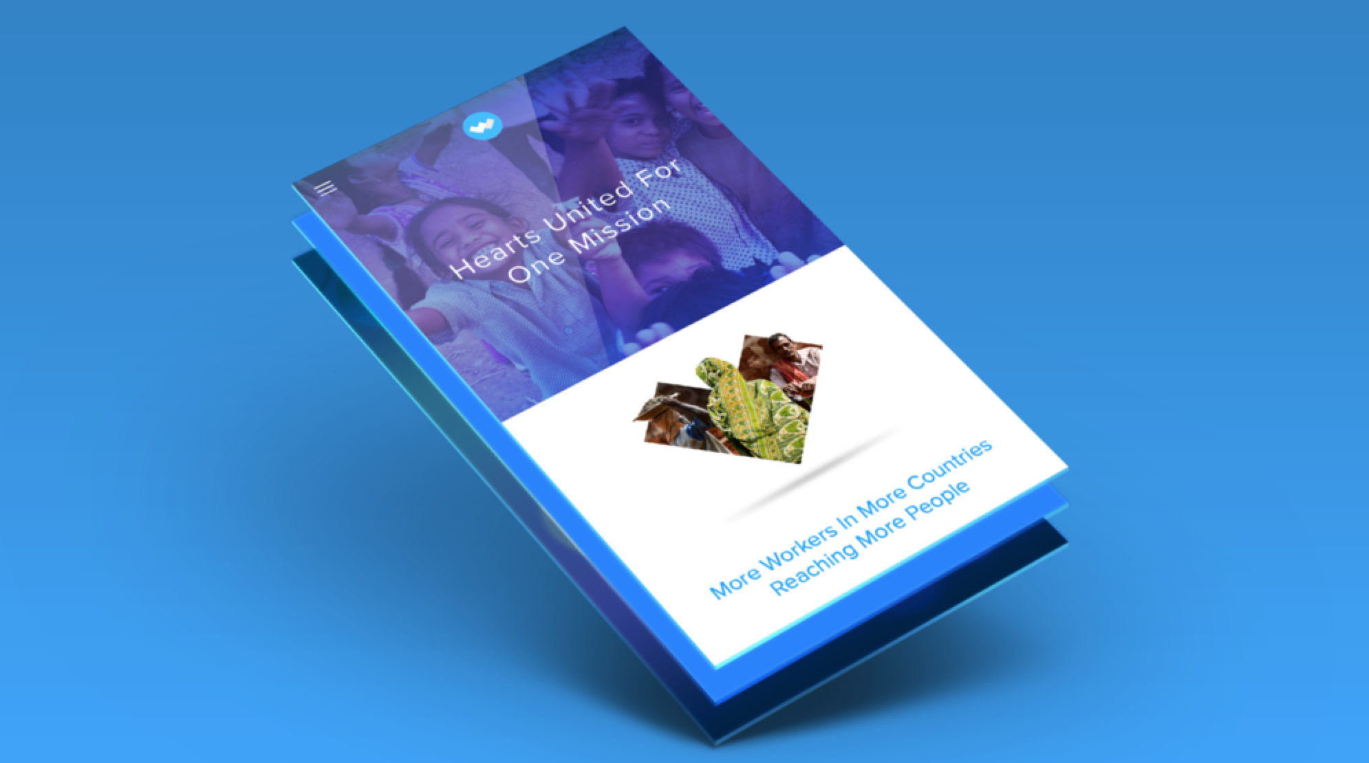
The process took over a year but in the end Worldlink came to life conceptually as a brand that had a new logo and identity that carried a strong message — Linking Hearts Worldwide. The iconic "W" is made up of two hearts coming together to symbolize your heart for the gospel linking with our indigenous missionaries' heart for the gospel. The two hearts sit within a blue circle representing the world. The mark is purposefully symbolic as in many countries any logo hinting at the gospel is met with violence and might put our workers in danger. The new visual identity is steeped in hope and promise — His promise that when we step out in faith with our hearts linked together and focused on Him amazing things can and WILL happen.
Worldlink will continue to evolve and innovate as it moves forward into a new chapter of its history.


